MLS kit rankings: All 30 new jerseys rated as America's soccer league prepares for Feb. 21 return to action
Every team has either a new home or away kit released for the next two years. Which ones are the most eye-catching?


The new Major League Soccer season kicks off in only 10 days with St. Louis City SC and Charlotte FC ringing in things on Saturday, Feb. 21. With the season around the corner, it's time to address the biggest issue of the off season. How are all the new threads that teams are wearing going to stack up? Due to MLS having a two-year cycle for jerseys, each team has either has released a home or away jersey ahead of this season, which means that they have to be ranked, because what else does one do when given new jerseys?
From music to historically designed kits, there's a lot to like in here, including the fact that not a single team released something that could be considered a plain white shirt with a logo. Don't worry, there are plain shirts of other colors with logos, with that out of the way, let's get ranking.
30. Nashville SC - The Reverb Kit

You can almost swap this with the next team on our list, Miami, without issue. The yellow is a nice color, but it also seems like a training shirt and could've used something else, anything else, to spruce it up.
29. Inter Miami - Presagio
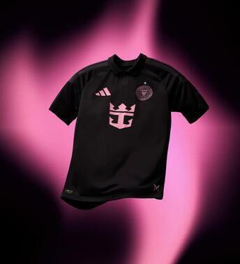
Is this a training top with an ad? Miami have great colors to work with, and this is what we got? It'll be everywhere with Lionel Messi's number 10 on it, but opening a new stadium this season, it would've been nice to see a bigger, bolder swing.
28. St. Louis City SC - The Tina Turner Kit
St. Louis did nail the design of this, looking like a flowing dress that the "Queen of Rock" would wear, but it's also odd as a soccer jersey. We've seen plenty of musical tributes around the league, and this one misses the mark.
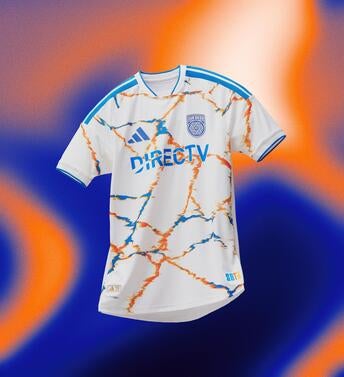
27. Houston Dynamo - Mission Control
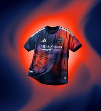
The concept of this being a satellite image of Houston is cool and unique, but how this works with their colors on the pitch will be interesting to see. This is one that could grow on you with time, but it's not catching me right now.
26. San Jose Earthquakes - The Dead Kit

In what may be the most polarizing kit in the league, you're either going to love or hate this with no in between. San Jose know their target audience here, honoring the Grateful Dead.
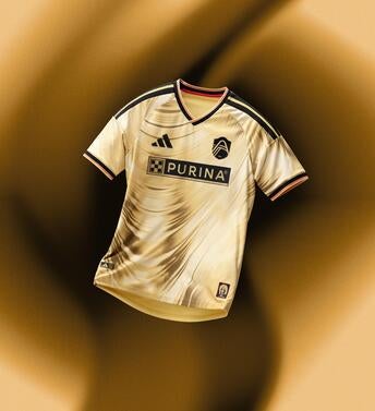
25. Columbus Crew - The Crafted for Excellence kit
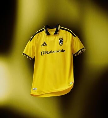
This is better than a standard yellow shirt, thanks to the collar, but there was room to do more.
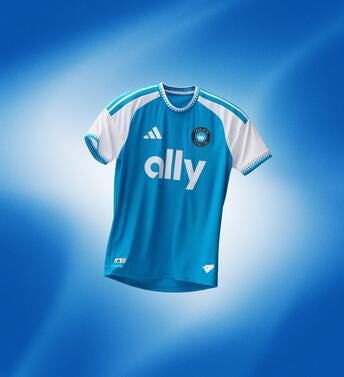
24. San Diego FC - Unprecedented Unity Kit
I can't get past the fact that this looks a bit like an oil spill on a marble countertop. San Diego has such a good team, and they deserve a kit to match.
23. New England Revolution - Independence Day

One of two America 250-themed jerseys on this list, the utilization of the badge to represent fireworks is cool, but also kind of clunky.
22. Atlanta United - Spirit of 96

The colors on this jersey are excellent, and it's cool to get the nod to the Olympic Games in the jersey, but when it comes to everything working together, the off-center sash makes things wonky for me. Central or leaning heavier into the green would've been excellent.
21. CF Montreal - The Procure Jersey
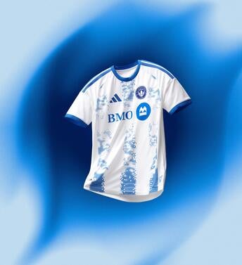
It's almost there, but it feels like CF Montreal are missing something here. I like the digital look, but they could've leaned further in. Instead the kid ends up giving the impression that the printer was running out of ink during printing.
20. FC Cincinnati - The Seven Hills Kit
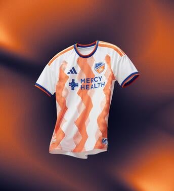
You get what Cincinatti are trying to do here, and the orange may end up growing on me, but it feels a bit cluttered. Credit for trying something outside the box.
19. Colorado Rapids - Colorful Colorado

Uh, I'm not sure where the colors went in this one. It's clean, and the trim does add to the jersey, making it a nice look, but there's so much that can be done with the burgundy that the Rapids sport.
18. DC United - The Black and Red Kit
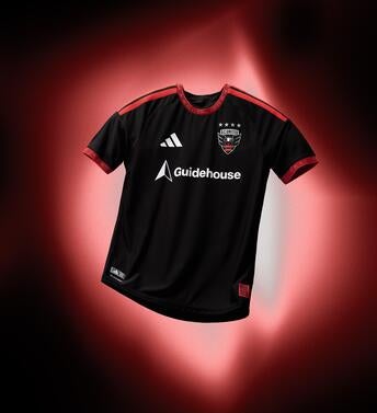
Technically, there's red in there. It's fine, but this is another team with a standard shirt that's saved by a nice detail in the trim.
17. Chicago Fire - Forever Red

You always know what you're going to get in Chicago's looks. The iconic red with a white stripe is instantly recognizable, and collars are always a nice touch. There's a thin line between classic and boring, but Chicago are on the right side of it. Just.
16. Orlando City SC - Sunken Treasure Kit

This is a tough one, while I think the purple elements are great, it doesn't feel like there's enough contrast in the shades of yellow, making the details hard to make out but it could seem different in person or on the pitch.
15. Austin FC - The Rooted Kit

Mint green is becoming a good look for Austin, as this is a clean jersey. The black of the Adidas stripes seems a little out of place here, but for working with a unique color, Austin have created something recognizable even when they don't use their primary colors, which is impressive.
14. LA Galaxy - The VeloCITY kit
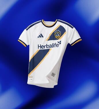
The Galaxy are an iconic brand in American soccer, so it makes sense that their home kit will reflect that. It's not a bad thing that it only reaches the top half of the new releases; that's a credit to improvement around the board.
13. Minnesota United - The Decade Kit

Minnesota are another club that does jerseys well. This is a great way to add a sash without it taking over a jersey, and the slight color elements are excellent.
12. Red Bull New York - The Rooted Kit
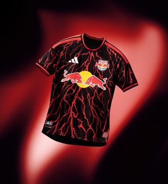
Going back to black but spicing it up in a nice way, this is a great way to usher in the Michael Bradley era at the club as he takes over at manager.
11. New York City FC - The All Nations Kit

Fitting design undertones in without making a shirt too busy can be tough, but the way NYCFC executed this is great. It's also the club's way of honoring the five boroughs ahead of the World Cup.
10. Charlotte FC - Carolina Kit: Crowns Up
An excellent one, as simplicity is better with this stellar shade of blue. The crowns integrated into the sleeves and the collar are a nice touch in an all-around great look.
9. Seattle Sounders - The Evergreen kit
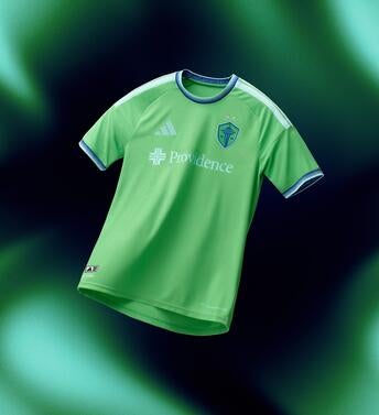
Mostly monotone jerseys can be great -- it's all about the detail, and that's something that Seattle nail. The slight texture in their iconic green also helps the logo pop, which is a nice touch. The ultimate if it ain't broke, don't fix it look.
8. Portland Timbers - Civic Stadium Kit
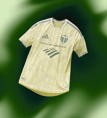
A lovely shade of green rarely seen in MLS, the Timbers are honoring the 100th anniversary of Providence Park in this look. The arches are a nice touch in a kit that will age well.
7. FC Dallas - DNA Kit
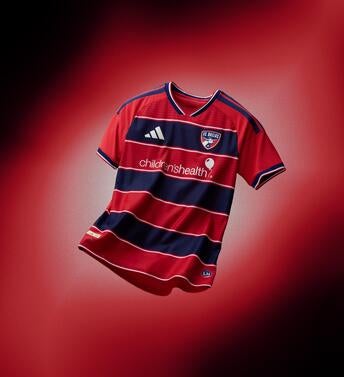
The name nails it. Dallas do a great job of giving an iconic look a fresh feel, and it's a nice touch putting some space between the hoops. This will look great on and off the pitch.
6. Real Salt Lake - The Switchback
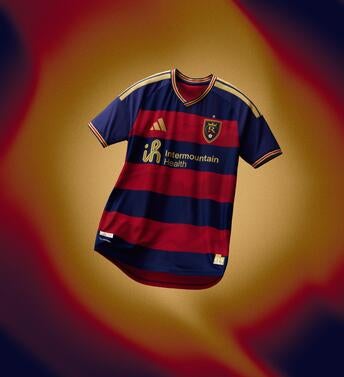
More hoops is always a good thing. Real Salt Lake have great colors, and this kit uses them well. The detail of the mountains is a nice touch in what is an all-around great look.
5. Vancouver - The Coastal Jersey

On one hand, this is a simple look that may be a bit understated, but the mountains around the collar and cuffs are such a nice touch, while even the sponsor looks like it belongs. A jersey doesn't always have to be busy to be great.
4. Toronto FC - Winter Kit

Refreshed roster and a refreshed kit to match. This is a clean look and immediately identifiable as Toronto's. The six stripes are also a nice touch to represent local communities.
3. Philadelphia Union - 1776 Kit

Looking to honor Philadelphia's place in America's history, the Union hit all the right notes here with elements of the team and city mixed throughout their unique jersey. It may be a little strange to keep this as a home look for two years, but right now as part of America's 250th birthday, Ben Franklin a solid look.
2. Los Angeles FC - 2026 Primary Kit
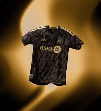
When your primary colors are black and gold, making a stunning kit is easier than some teams have it but the attention to detail is where LAFC nail it by weaving the gold into the jersey while still giving it a striking appearance.
1. Sporting Kansas City - The 18th & Vine Kit

Sporting with another banger. The jersey honors their jazz district, and you can pick up the vibe just from looking at it. Excellent work all around in a shirt that will age well with time.