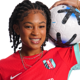
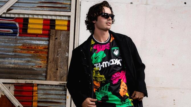
NWSL jersey rankings: Who has the best new kit ahead of 2026 season as Boston, Denver join the party?
There are some wildly creative kits among this year's batch, but which one is the best?

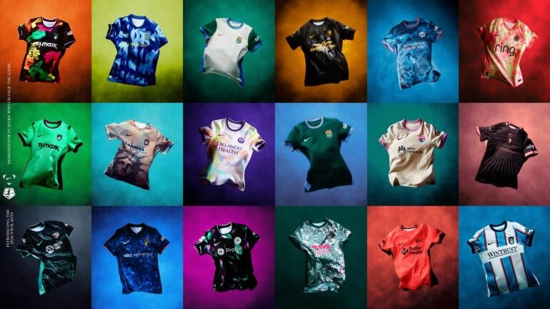
You know the 2026 NWSL season is getting closer when teams officially unveil their jerseys. All 16 clubs have a new kit to debut, with two new expansion sides rolling out four shirts between them. Some will be primaries, others will be secondaries, but most are third option kits, and that's where the fun comes in for a few clubs.
Today's soccer kit culture is partially about honoring a club's history, but that's not all. In this era, it's about making sure you're doing that while keeping up with current trends to combine with wearability. Nowadays, fans aren't just sporting jerseys on gamedays; they are part of everyday wardrobes and even a form of expression, depending on how one opts to style them.
So naturally, with all that in mind, I am totally going to rank the 2026 NWSL kits. What does that mean? What is the hip criteria – no, not that one — that will be used to judge them? Well, for starters, it will just be me and my eyeballs and what I think about them.
The truth is that, unlike last year's rollout, where the majority of the kits just seemed aggressively fine, the third kit options are a chance for some fun, so I'll be looking for that too. Significance or special meaning might tip the scales a little bit, but I'm not super interested in 50 different ways to name shades of blue or green.
While I am an advocate for club shops to offer shorts and team socks to fandoms, the teams' entire "uniform" will not matter to me here. What does the shirt look like? Does it look more like a soccer kit or a warm-up outfit? Can you wear it outside of a matchday, and will it look cool on players and on supporters? That's about it.
With that, let's get to ranking the 2026 NWSL kits, and don't forget -- you can watch select NWSL games this season on Paramount+.
1. Seattle Reign: The Surge (third)
Truly a love-it-or-hate-it type of kit, and by god, this random writer on the internet loves it. If your team is one that sits on the cool side of the color spectrum, you're ahead of the game because cool colors are, well, cool. Seattle does a good job of throwing it way back to their early shades and paying homage to their "highlighter" kits with subtle accents.
Combined with a bold, kind of random geometric pattern, it's delivering on third kit concepts in general -- fun, confusing, and maybe even soccer moms and dads will wear it alongside their kids. Mia Fishel will look cool scoring goals in it, and the casual fan will have enough flair in the kit to pop outside of gamedays.
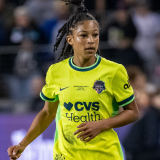
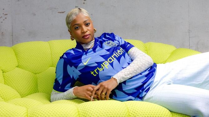
2. Kansas City Current: Storm kit (third)
It's hard to make a kit that everyone, whether on the pitch or in the stands, will look good in. But the 2025 NWSL Shield winners did just that. The roster is gonna look edgy in their new Storm kits, a dark navy jersey with teal currents running all over it.
The numbers are also in Kansas City's iconic teal hue, and even though it's a third kit, it's exactly the type of jersey you'll want to see your team in regularly if you're a fan. A great color combo that makes the crest pop with its small hints of red, and the details are meant to represent exactly what a water current is with continuous movement throughout.
3. Chicago Stars FC: Gameday DNA kit (primary)
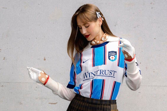
Chicago finally have the kit that matches their rebrand and is probably the only jersey in the rollout that says "soccer kit" the second you look at it. Is it a Serie A side? Is it a Liga MX team? No, it's Chicago's NWSL team, Stars FC, and they are sporting a shirt that is somehow both modern and classic.
It still doesn't beat their 2019 "elevated" kit in my book, but it's a great start for this next era. Gone are the iconic four red stars across the chest, and that's fine; they belong on the flag, where the club borrows some of its imagery from. Including the striping, the vertical lines narrow as they head outward, just like bars on the city's flag.
4. Angel City FC: Flare kit (primary)
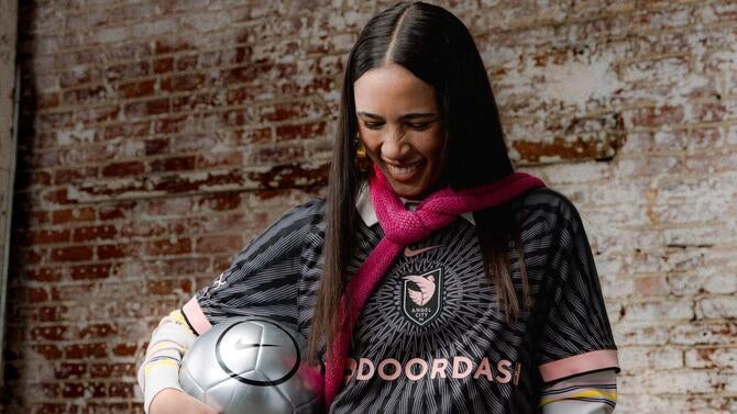
I need to preface this by saying that I think center crests are dumb. Unless they are used to commemorate a team's achievements -- World Cup wins, Continental tournaments -- leave them where they are supposed to be, on the left-hand side of the shirt. That being said, congrats to Angel City FC, who made sure the kit was so good that it bumped them near the top.
I think a primary black kit with just the right amount of detail is great, and the organization delivered one to celebrate its fifth anniversary as a club. A cool design that mirrors a sol image and a nod to the pink (sol rosa) accents throughout the kit. You add the number five instead of the letter S in the club's slogan "VOLEMO5," and it's a simple twist that works.
5. Gotham FC: Lady Liberty kit (third)
Commiserations to all the New Jersey faithful out there. If Gotham weren't fully separating themselves from the Garden State in name (they dropped NJ/NY in front of their moniker last season), they certainly are now with this extremely, undeniably, New York City kit.
Inside Gotham's third kit is a not-so-hidden image of the Statue of Liberty's head. Wrapped in shades of blue and orange, NYC's flag colors, the closer you get, the blurrier it becomes. But that's where the fun lines come into play. The farther away you go, Lady Liberty pops up like a 90's magic eye 3D puzzle you don't have to strain your eyes to see. Not for you? That's ok. Champion sentiment means they get to rock what they want.
6. Racing Louisville FC: Disco kit (third)
Did you know that Louisville makes more than bourbon and baseball bats? At one point, they produced 90% of the world's disco balls during the disco era, and this third kit is a shout-out to that time.
It's creative, out-of-the-box look means that instead of just a simple design outlining a disco ball, Racing's kit is a literal reflection. You see splashes of purple and green hues throughout the kit, like lights hitting a mirrored globe, defined by black borders. The pride mark "Made in Looavul" is a great way to make sure folks put respect on your name. A great kit and sentiment for a club that's coming off its first playoff appearance.
7. Orlando Pride: Unity kit (secondary)
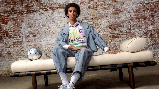
Speaking of sentimental, Orlando Pride's secondary kit tugs at the heartstrings, and if they didn't, they might not be this high on the rankings.
At first glance, you're a bit confused as to why the Pride's purple goes missing for a mix of pastels, and that's a bummer, but then you learn the significance, and you can't help but appreciate it. The kit is a commemoration of the 10-year remembrance of the Pulse Nightclub tragedy. Gone is the typical purple of the Pride; it's just trim color here. In its place is a white base with soft pastel ribbons and a purple "unity" dove as a subtle pride mark.
It's absolutely a message that everyone should get behind, and one that moves me as a member of the LGBTQ+ community. Though in a time where things feel muted, or even shushed, I would've loved to see the Pride lean into what they're actually trying to honor here. A proud, vibrant community. I hope we get another one of these and keep it loud. Keep dancing, Orlando.
8. Washington Spirit: Spirit in Bloom kit (primary)
Fans of the club will finally feel heard and seen as the Spirit roll out a cherry blossom kit that supporters have clamored for. I, too, was hopeful we'd someday see a Spirit cherry blossom kit, and now it's here. A jersey to feature the district's iconic cherry blossom trees and combines a dark green hue that's meant to represent the Potomac River.
I am a little disappointed that the crest can't really be seen, as it gets a little lost in the pattern. Similar to Gotham, the blossoms seem to bloom a bit better the further away you see them, and the pink numbers will also stand out. Get closer, and it's a little paint-by-numbers. It's definitely miles away from what Spirit kits used to look like, and it keeps that dark green hue that made its way into Spirit gear just last season.
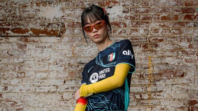
9. North Carolina Courage: Become kit (third)
I'll just be frank, hate the name, but love the concept. This jersey is supposed to be the third component of the Courage's rally cry campaign, "the place to be," and after previous kits "Believe" and "Belong." Yeah, I don't get it either, dude, just give me a cool kit. Finally, the Courage have done it with this Venus flytrap-themed kit.
It's such a cool concept that it makes me even more annoyed that it's just called "Become" and not something else like Audrey or literally even just the Venus flytrap kit. The flytrap is native to North Carolina, and its outline can be seen throughout the entire two shades of blue kit. The bright pink trim on the sleeves also outlines the crest and other areas of the kit for extra detail.
10. Boston Legacy: First Light (primary) and Common Ground kits (secondary)
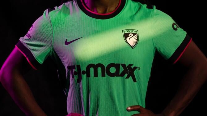
Congrats to Boston on making it to the middle of the rankings, and that's absolutely a compliment. Many expansion teams of the past were only able to submit color templates, and while the First Light kit can come off simple, that's not a bad thing. I thought the Common Ground jersey was just a little too color-run-marathon paint splatters for me, but I love that it's actually meant to represent Boston's neighborhoods.
The outer pride mark adds another nice level of detail to commemorate the inaugural season and the Franklin Park Zoo near White Stadium, featuring two bears holding a soccer ball to honor Legacy's first year. If I'm going with one, I'm rocking the primary kit, an almost neon green vibe that's not too blinding and complements Boston's crest.
10. Bay FC: Poppy kit (third)
Bay FC opted to make some simple changes for a fresh look, and it works. After an inaugural season with Dark navy's and subtle grey's, and just a poppy color as more of an accent, the Poppy kit is literally all poppy. The details in the kit are a bridge pattern, but my favorite is the flip of the crest. It's not the typical team crest, but just the letters B. F. C. in an almost gothic-looking script, and I think that's cool for a team that wants to be the best effing club.
11. Houston Dash: Houston Chronicles kit (third)
I can't believe I'm going to say this, but I kind of miss when the Houston Dash were the orange team. I'm being dramatic since they still have an orange kit, but last year's secondary, and now this year's third option, where's love? I also am gonna contradict myself and say that even for a third kit, it's almost got too much going on.
There's an image of the Houston Chronicle building, there's magnolia flowers, there's paisley patterns, geometric textiles, and there's a shout-out to "Space City" to reference NASA. It's a map, but also not really. That's where the blue colorway probably works here. I imagine a lot of these patterns and images go missing in an orange hue, and now that I type it all out, it'll probably grow on me.
Also, the Cancer touch on the jersey, which has been a staple on their kits, always deserves praise.
13. San Diego Wave FC: Balboa Park kit (third)
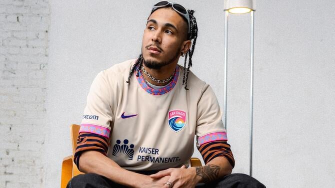
Hopefully, the Balboa Park kit being a third jersey option means there will be more time for the "del sol" kit to exist, because unfortunately, it falls a little short, given the bar was set so high by the previous kit. I love the trim on this jersey so much, a nod to the tile work at Balboa Park's fountain, and I wish there was a way it was incorporated more throughout the kit because it goes missing otherwise.
14. Portland Thorns FC: Electric Bloom kit (primary)
Like Houston, I miss when Portland were the red team. The club has drifted into more shades of red than just the color itself, and this kit is no different. It plays up the fact that thorns are indeed on roses, and now they're even incorporating yellow roses. The colors are listed as voltage yellow roses and atomic pink.
I do really like the way the club crest looks on this kit and do wonder if it would look this good on a different jersey, but maybe all the elements together are what makes it work.
15. Denver Summit: Evergreen (primary) and Summit Snow (secondary) kits
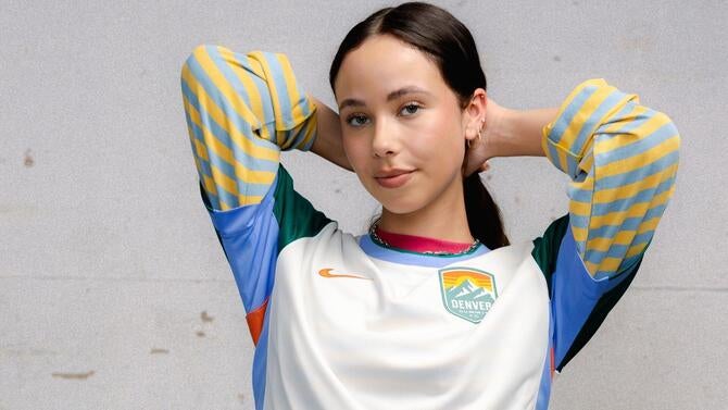
Another expansion side that launched two kits, Denver Summit, absolutely nails the colorway with their jerseys but falls short in much else.
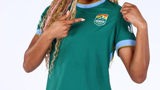
You know a jersey is too plain or average when the kit information details are more vivid than what's actually on the shirt. It just kind of looks like they ran out of time or could only pick a template, and might as well go with one that could show off the club colors. That isn't uncommon. There are plenty of expansion sides who've arrived in a similar fashion.
Denver have a great club name and a good color scheme, which hopefully means better kits in the future. Let's see those infamous mountains on a kit someday. They could even take some inspiration from their recent crossover promotion with the Denver Nuggets.
16. Utah Royals: Swarm kit (third)
Have you ever gone to a concert or festival, and you're just in the moment vibing, and you happen to walk toward the bathrooms, but a security guard yells at you for trying to go left when you should've turned right? They're mad that they're working the event, and annoyed that you're having fun, and point you in the other direction with their big, bold, yellow lettering? That's what this is for me, unfortunately.
It's giving killjoy ops, so it's a pass for me. But because it is a black kit, which are usually winners in my book, it will likely sell and be a favorite among fans. I do hope the Bee theme can be revisited because I would truly want to see what the Royals could do with a bumble bee type of style that doesn't go missing with a lion's head.