Ranking NFL's uniform changes for 2020: Seven teams have new threads; here's who'll look the best
One team's rebrand is clearly above the rest
While there hasn't been a whole lot going on in the sports world over the past few months, this has been a pretty busy offseason for the NFL. Not only have a ton of notable players changed uniforms via trades and free agency, some of those uniforms have changed as well.
More than a half-dozen clubs have announced varying degrees of alterations to their uniforms this offseason but not every uniform switch is created equal. Let's take a look at the changes and rank them from worst to first.
7. Los Angeles Rams
The Rams' uniform set has sort of been a weird mess for the past number of years. They wore royal and gold at home, then navy and white on the road. Both uniforms are solid in their own right but there wasn't a lot of consistency going on with the set. A change was needed.
However, not all change is automatically good change, and we found that out the hard way.
2020 Drip pic.twitter.com/cGuAxRcurO
— Jalen Ramsey (@jalenramsey) May 13, 2020
Closer look at the @RamsNFL new uniforms. 👇🏻 pic.twitter.com/odQeI1iZ7F
— Andrew Siciliano (@AndrewSiciliano) May 13, 2020
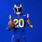
The Rams lowered the bar of expectations when they unveiled a new logo that was pretty much unanimously panned, and these uniforms might still somehow be even worse than most people expected. The overall design is pretty boring and weak -- it looks like a knockoff, like these would belong to the Unlicensed Los Angeles Rams.
The helmet is fine, honestly -- all of my issues lie within the uniform. The gradient on the home uniform numbers seems so unnecessary and tacky, the "bone" away uniforms don't have enough color to be remotely interesting. The highlighter striping down the side of the away pants is terrible. And don't even get me started on those damn name tags.
Overall, it's honestly impressive that the Rams were able to take a such a classic look and turn it into something so, so terrible. This entire rebrand has been one big disaster.
6. Atlanta Falcons
You can make the argument that the Falcons were due for a refresh on their look, which has remained largely the same since the Mike Vick era, but you certainly can't make the argument that this is the best they could have done.
For our team.
— Atlanta Falcons (@AtlantaFalcons) April 8, 2020
Our fans.
⁰Our city. pic.twitter.com/15e5ZX6EtE
Uniforms in action. pic.twitter.com/D346iR2a0z
— Atlanta Falcons (@AtlantaFalcons) April 8, 2020
There's a fine line between "minimalistic" and "generic" and, unfortunately, Atlanta's new threads land on the side of brutally generic. They look like the uniforms you'd be given after relocating a franchise in Madden. Red, white and black is an easy color scheme to make pop but somehow these fall flat.
There are a few positives: The enlarged helmet decal looks pretty nice, as does the chrome outline around the logo. I also like the switch face masks. And while I do respect them for going for it on the gradient look, the execution comes up a bit short.
Ultimately, the Falcons could have done themselves a big favor by reverting to the old school black unis full-time and then pairing them with a red version of the new helmet.
5. Indianapolis Colts
If you didn't know any better, you might not even realize that the Colts made any uniform changes this offseason.
#Colts have made a minor change to their uniforms (jersey numbers), while also adding a new secondary logo and a new wordmark. pic.twitter.com/runsNmd77s
— NFL Update (@MySportsUpdate) April 13, 2020
Basically, the only changes on the Colts uniforms are the numbers and the wordmark. They're very subtle tweaks, which isn't necessarily a bad thing considering Indy has a clean and classic look, but I do think the numbers give the uniforms a bit more personality. The wordmark is an upgrade as well. Good stuff, but nothing earth-shattering.
4. New England Patriots
The Patriots uniforms were getting stale and it makes a lot of sense to make a change with Tom Brady leaving the team. There's a new era in New England on the horizon, so it makes sense to bring in a new look.
Here they are, the Patriots official new uniforms. The new primary blues are the Color Rush they’ve been wearing since 2016. The road whites are brand new. Thoughts? pic.twitter.com/Lp9AbSbZUo
— Zack Cox (@ZackCoxNESN) April 20, 2020
I don't necessarily dislike the new set, which is essentially a promotion of the team's Color Rush jersey (plus the addition of a corresponding away uniform), but they're nothing more than fine. At worst, it seems like a hasty, uninspired refresh.
I think I might find the look more favorable had they incorporated some silver, red and/or white pants to give them more variety with the set.
At the end of the day, I still think this concept from 2014 would have been a better option -- especially considering a white helmet shell would allow them to rotate between the modern navy look and the throwback Pat Patriot look.
Take the new logo, slap it on the old white helmets, use these jerseys. Done and done...take my money. pic.twitter.com/VJln7VuYCP
— Pete Blackburn (@PeteBlackburn) November 24, 2014
3. Tampa Bay Buccaneers
When grading the Bucs' "new" look, it's important to consider this: Almost anything would have been an upgrade over what they've been wearing for the past handful of years. Those alarm clock uniforms were an atrocity.
Allow us to show you the future 😏#GoBucs pic.twitter.com/naURTtwkZ3
— Tampa Bay Buccaneers (@Buccaneers) April 7, 2020
While they're not spectacular by any means, they are a significant upgrade that will have Tampa looking good next season. They're also not exactly "new" considering the primary set is almost exactly the same as the uniforms the Bucs wore in the early 2000s (though with some orange accents). That's not necessarily a bad thing -- Tampa is essentially admitting they completely screwed up their last rebrand and hitting the reset button. Also, they won the Super Bowl with this look.
The all-pewter Color Rush alternate adds a spicy twist to the set.
Overall, it's a clean upgrade to a franchise that desperately needed it. That being said, going with an updated version of the Bucco Bruce creamsicle look was the move they should have made here. They would have sold ALL the merch.
In the year 2021, it’ll be Monday Night Football. Buccaneers vs. Patriots and the Bucs will be wearing these creamsicle throwback jerseys. You heard it here first. pic.twitter.com/DHXwtinQMU
— Chris (@ChrisNole8) May 1, 2020
2. Cleveland Browns
Much like the Bucs, the Browns were in a position of strength heading into this switch: Their other uniforms stunk and almost anything would have been an upgrade. Luckily for the Browns, they had an all-time classic look already stashed.
We pay homage to the past and look ahead to the future with our new uniforms
— Cleveland Browns (@Browns) April 15, 2020
📰: https://t.co/QdX0WYeRkx pic.twitter.com/KkHuSUIT9F
Cleveland Browns' new uniforms, a nod to the franchise's traditional look: pic.twitter.com/LSeXN8yLwK
— Jake Trotter (@Jake_Trotter) April 15, 2020
The only thing carrying over from the Browns' previous uniform is the helmet, and that's the way it should be. Going back to the older jersey style embraces the history of the franchise and one of the NFL's most iconic looks, so it was the right call. I'll go to war for the brown-on-white home uni being one of the very best in the NFL.
Cleveland basically knocked every part of the switch out of the park, but it's hard to give them a ton of credit considering they never should have gone away from them in the first place
1. Los Angeles Chargers
While most of the changes this offseason have been underwhelming or just straight-up bad, the Chargers were just about the only team that crushed a completely creative rebrand.
the best got better. pic.twitter.com/UTXPM8yYvI
— Los Angeles Chargers (@Chargers) April 21, 2020
Their new collection of unis brings at least a half-dozen combinations of looks that include the powder blue, Color Rush blue and retro navy -- all accented with electric yellow. The uniforms also bring a very nice blend of tradition and and modern elements, which can often be hard to pull off. These seemed to be a unanimous hit, which is a nearly impossible feat in the day and age of Twitter.
I'm a big fan of the helmet number decals and the yellow pants, and it's refreshing to be reminded that a team can still be creative and innovative with their uniforms while knocking it out of the park. These might be the best uniforms in the NFL now.
The rebrand also comes as a pretty pivotal time for the Chargers, who are entering a new era (presumably with a new franchise quarterback at the helm) and are competing for fan loyalty in a shared city. These new unis might make the Chargers the "cool" team in LA moving forward. It also probably helps that the Rams are cutting ties with popular players and getting ruthlessly mocked for their own rebrand, but you gotta give credit to the Chargers for making their move in (and with) electric fashion.


