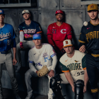
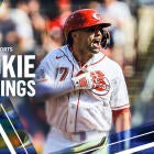
Ranking MLB's eight new City Connect jerseys for 2026
The Braves, Orioles, Padres, Pirates, Reds, Rangers, Royals and Brewers will roll out new alternate uniforms this month

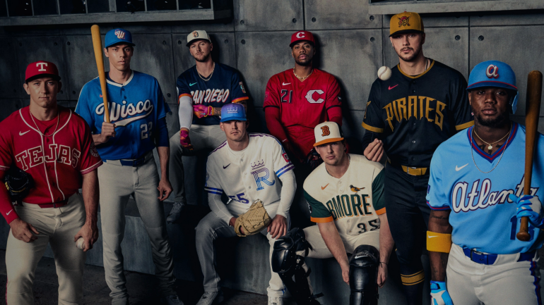
Eight Major League Baseball teams will get new City Connect jerseys for 2026, the clubs announced on Thursday. The alternate uniforms, first launched in 2021, are intended to represent each team's home and history through color, imagery and even font.
"Each team explored its values, mottos and regional influences to create a uniform rooted in emotional connection and cultural authenticity," the league said in a statement. "With each club returning for a second City Connect edition, this year's uniforms build on past foundations while expanding into new dimensions of the city, region and fan base. The uniforms will remain part of each club's on-field rotation for multiple seasons to come."
So let's rank them. I liked at least six of them and absolutely loved three.

8. Milwaukee Brewers
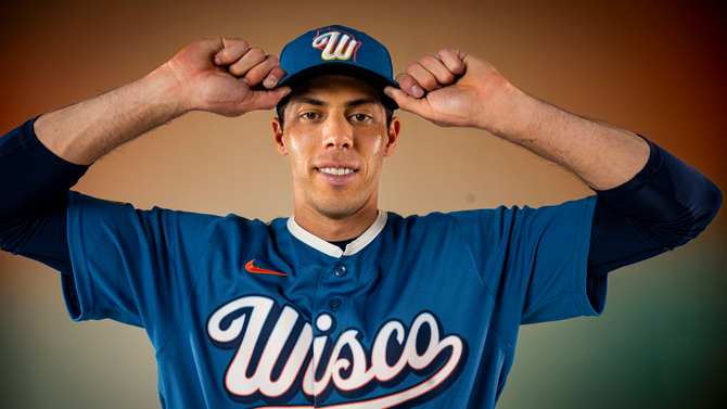
MLB description: A water-toned base and cream accent evoke Wisconsin's endless lakes, sandy shores and sandstone bluffs, while a gradient wordmark captures the state's beautiful summer sunsets. A "Wisco" wordmark on the chest, state motto on the collar, bobber jock tag detail and redesigned Barrelman sleeve patch round out a uniform that celebrates the team's history and Wisconsin's rich heritage.
Debut: April 10 at American Family Field against the Washington Nationals
My take: My affinity for the ball-in-glove logo from the Brewers that I saw growing up -- the best logo in sports history -- clouds every judgment I have on Brewers logos or jerseys. I admit that up front. I really don't like these, though. There is, of course, a story behind all the colors chosen, it just doesn't feel like the Brewers. And "Wisco?" People say that?

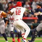
7. Kansas City Royals
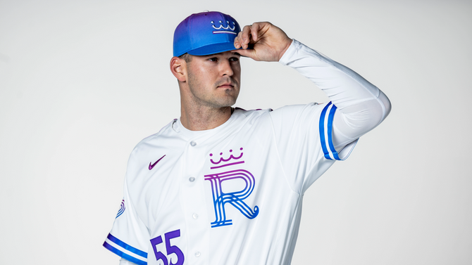
MLB description: A bold fuchsia-to-blue gradient draws inspiration from Kansas City's official City of Fountains logo, channeling the spirit of the city's people and iconic waterways. The updated "R" logo pays homage to the Club's original 1969 mark, while a heart logo reflects Kansas City's place as the nation's heartland.
Debut: April 10 at Kauffman Stadium against the Chicago White Sox
My take: Taste is going to vary here, as always with these things, but it's a no sale for me on this color combination. The story behind it is good and all, I just don't like how it looks for a baseball uniform. I do like the crown a lot and love the Beatles reference inside the collar of the jerseys (it says, "HEY HEY HEY HEY" as the Royals play "Kansas City/Hey Hey Hey Hey" by the Beatles after wins in Kauffman Stadium).

6. Baltimore Orioles
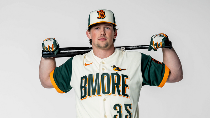
MLB description: Rooted in the soul of Baltimore, the design pays tribute to Camden Yards through motifs including the brass home run plaques, wrought-iron scoreboard clock and a Camden "B" inspired by the 1890s Baltimore Baseball Club. An Oriole bird sits perched proudly atop the "BMORE" wordmark.
Debut: April 10 at Oriole Park at Camden Yards against the San Francisco Giants
My take: The colors don't really do anything for me, but everything else is positive. I love the callouts for Camden, which is one of the most influential ballparks in MLB history, and that bird perched on the "R" is gorgeous work. Also, a fun fact on the 1890s Baltimore Baseball Club: It wasn't the same franchise as these Orioles but was called the Orioles. Those Orioles lasted 18 seasons in the American Association through 1899. The Orioles we now know were the St. Louis Browns from 1902-53 before moving to Baltimore and becoming the current iteration of the O's.

5. Texas Rangers
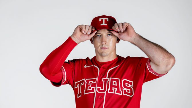
MLB description: Cochineal red anchors a design steeped in Texas and Mexican heritage, highlighted by the "Tejas" chest wordmark, a charro-embossed belt and mariachi-inspired fill patterns.
Debut: April 24 at Globe Life Field against the Athletics
My take: It's a noble effort to blend Texas and Mexican heritage and I love that it's Tejas on the chest, but we couldn't mix in one more color here? Something in the piping maybe, or even just part of the arm patches? These are overall a positive, absolutely, I just wondered if there was a way to jazz them up slightly. Still, the basic design is sharp.

4. San Diego Padres
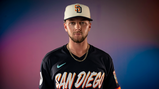
MLB description: Celebrating the Padres' bi-national region and culture through honoring its traditions and families with a focus on Día de los Muertos, the design features a sunset-ombre "San Diego" chest wordmark, La Catrina sleeve patch, marigold-patterned trim, bone colored hat and pants, and papel picado jock tag.
Debut: April 10 at Petco Park against the Colorado Rockies
My take: My initial thought was "this doesn't look enough like the Padres," but two things here. First off, there's no rule that says the City Connects have to resemble the actual team uniforms. We've seen plenty over the past several years that illustrated as much (the Red Sox, Nationals and the previous Padres ones come to mind). Secondly, the longer I looked at these, the more they grew on me. It's a cool set of colors blended nicely and I like the patch.

3. Cincinnati Reds

MLB description: Embracing the color that defines the franchise, pinstripes make a modern comeback in a tone-on-tone style and a nod to the popular vest-style jersey last worn more than two decades ago. A sleeve graphic features the iconic Tyler Davidson Fountain, which begins flowing each year around Opening Day.
Debut: April 11 at Great American Ball Park against the Los Angeles Angels
My take: I think it's polarizing, but I really like the way they've done the "C" here. I love the full-body red, too, especially with the black lettering/numbering. That really pops. The main event, though, is the subtle pinstripes on the jerseys and pants that also make their way onto the hats. The Tyler Davidson Fountain is a great, local touch, too. When I decided to rank these, I was looking at the Reds' uniforms and assumed they'd be my No. 1. This set of City Connects hit three home runs for me.

2. Atlanta Braves
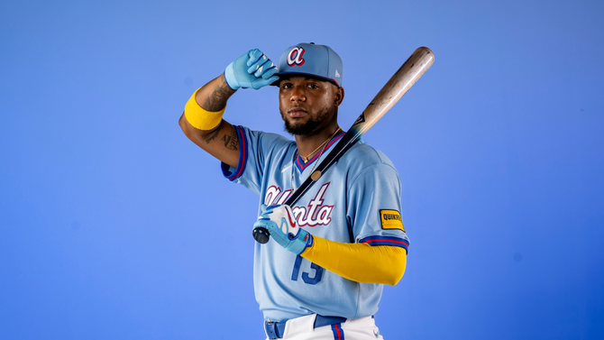
MLB description: A brighter powder blue anchors the design as a modernized callback to the Club's beloved 1980s uniforms. Red piping, an updated "Atlanta" script and "ATL" block letter sleeve patch marry vintage style with today's team colors.
Debut: April 10 at Truist Park against the Cleveland Guardians
My take: The lower case "a" is such a perfect idea as it has long been one of their greatest throwback looks. The powder blue jerseys have not reached a saturation point with me yet, meaning I absolutely love pretty much every single one of them. Let's hope it doesn't become like the late '90s teal fad where it became overplayed. For now, I'm a gigantic fan.

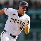
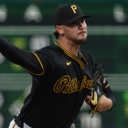
1. Pittsburgh Pirates
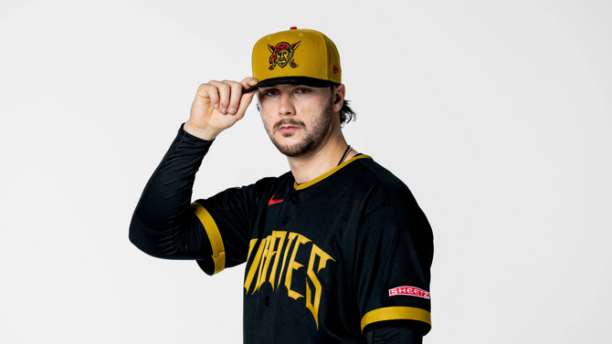
MLB description: Built around Pittsburgh's unmistakable black and gold identity, the uniform features a rugged, pirate-style wordmark whose font draws inspiration from the city's "Sister Bridges." Red accents and Jolly Roger elements add boldness without breaking the city's iconic color palette.
Debut: April 17 at PNC Park against the Tampa Bay Rays
My take: The black-and-gold combo has long been a favorite of mine and the execution here is masterful. The way those "PIRATES" letters just seem to bleed downward from the chest is great and I love the touch of throwing the actual pirate logo with the swords on the hat. These are more than a home run. Grand slam.